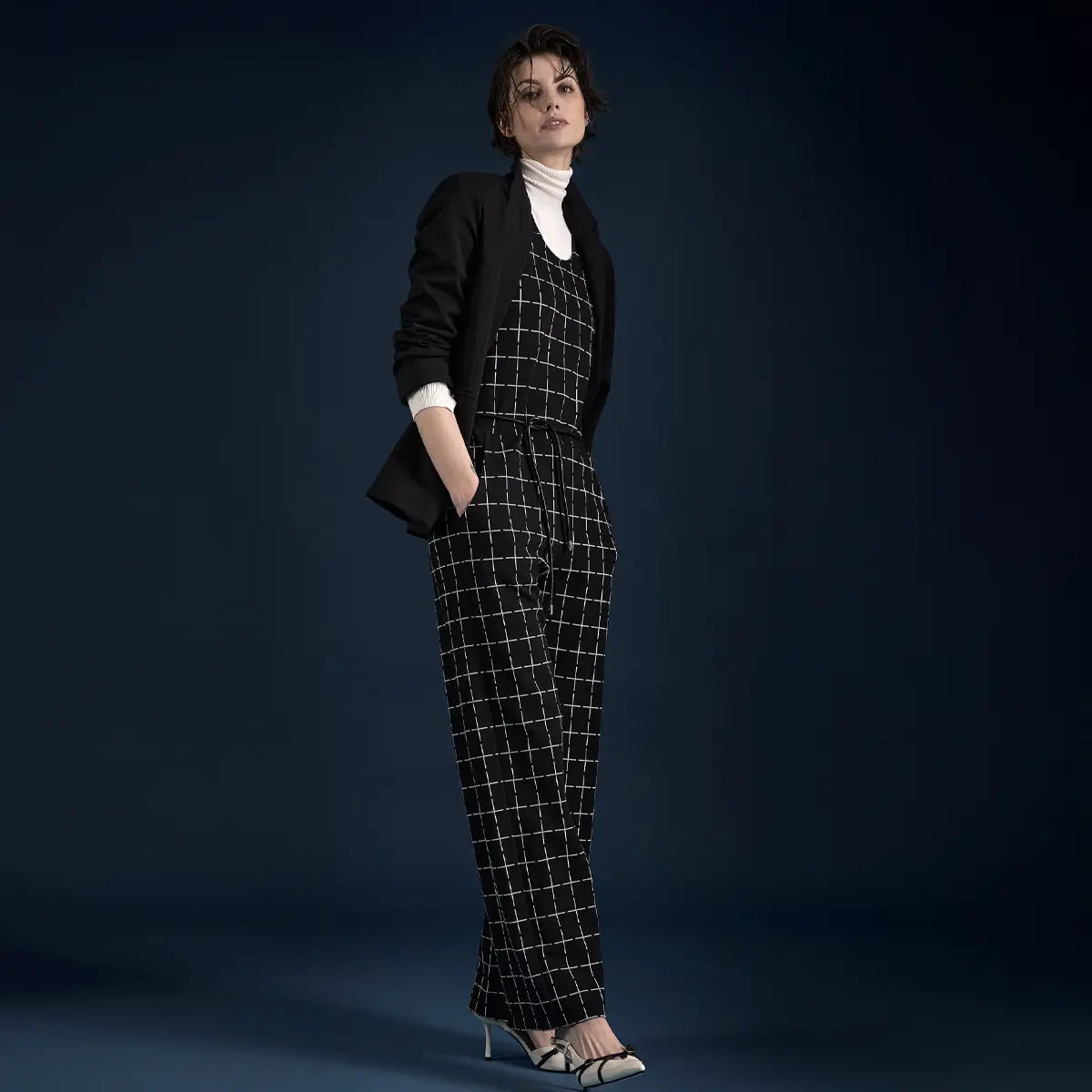


Color psychology describes how colors influence our emotions, our perception, and our behavior—often without us even realizing it.
That Loriot sketch about the effect of colors on our mood is unforgettable: “Women kill themselves in purple living room sets.” This quote from “Ödipussi” pokes fun at color psychology—yet it shows just how much the topic preoccupies us. Because somehow we’ve all been there: Some days, it just has to be the blue coat, or the red shoes, or the green dress. Why? We often can’t say—it’s just the way it is. One thing is clear:colors have a major influence on how we feel —and the extent to which they shape our emotions is often underestimated.
In this guide:
How Colors Affect Us: Psychology, Conditioning, and Culture Interactive: Try out the Color Explorer Warm Colors: Red, Orange, Yellow Cool Colors: Blue, Green, Violet Pink & Rose Neutral & Non-Colors: Black, White, Gray, Earth Tones Pastel shades Which color for which occasionStyling Dos & Don’ts Frequently Asked Questions About the Effects of Colors
The Effects of Colors: Psychology, Conditioning, and Culture
Each of us has experienced feeling uncomfortable or especially comfortable around certain colors. A room painted light yellow feels sunny and warm and evokes positive emotions in many people. And what about many teenagers’ preference for black? It often stems from a desire to set themselves apart. We associate white with purity, and red—as a signal color—with danger or sensuality.
Research shows that our emotional reactions to colors are based partly on psychological effects and partly—to a large extent—on conditioning and cultural influences. A color that has positive connotations in one culture may be considered an unlucky color in another. As a general rule, warm colors such as yellow, red, and orange have a different effect than cool tones such as blue, violet, or green. Bold hues have a stronger impact than pastel shades, and we pay particular attention to complementary colors because they create the greatest contrasts.

Orange is warmth you can wear—communicative, sociable, pure good cheer. @AI Illustration
Three examples illustrate how the effect of color varies across cultures: In the West, red is associated with danger (red traffic lights!) and passion, but it also has a stimulating effect—which is why experts advise against painting bedrooms or children’s rooms red. In Buddhist temples, on the other hand, red is the color of meditation. In cooler climates, we perceive yellow as sunny and positive, whereas in desert regions it is seen as more of a threat. And blue, in all its shades, has positive connotations in every culture—from the indigenous peoples of the Americas to the Bedouins of the Sahara to the Christian-influenced Western world, it universally symbolizes vastness and tranquility.
Interactive: Try out the Color Explorer at
Want to explore it for yourself? In the Color Explorer, you can select a color and immediately see its effect—or start with a feeling and find the right color. Type in a feeling or click through the shades.
Color
Blue
Calm · Trust · Space
Behavior
Calms, promotes concentration, and builds trust.
Culture
The only color that has positive connotations in every culture.
Curiosities
From Native Americans to the Sahara, blue symbolizes vastness and tranquility everywhere.
In an outfit
Blue conveys a sense of professionalism—it's the safe choice for a job interview.
The effects of colors are partly scientifically proven and partly culturally influenced.
Warm colors: red, orange, yellow
Regardless of cultural background, warm colors have a stimulating effect. They have a similar effect on our mood as the light of a sunny day—we feel more active and lively.
Red
Red is the quintessential attention-grabbing color: It gets your heart racing, signals presence, and can even stimulate your appetite —one of the reasons why red is so popular in restaurants and cafeterias. Wear it when you want to be noticed.
Orange
Orange comes across as warm, communicative, and sociable—the very essence of “dopamine dressing.” Like red, it can stimulate the appetite and instantly add a cheerful touch to an outfit.
Yellow
Yellow makes us feel more alert and attentive and lifts our spirits. Even just one yellow piece is enough to give your outfit an energy boost.

Red signals presence—those who wear it want to be seen. @AI illustration
Cool colors: blue, green, violet
Regardless of cultural background, cool colors have a calming effect. They have a similar effect on our mood as the light of a clear winter morning or a fresh sea breeze—we feel more relaxed and balanced.
Blue & Turquoise
Shades of blue are among the most popular colors because they have a calming and harmonizing effect on virtually everyone. Blue evokes a sense of vastness and openness, like the sky or the sea, and inspires trust—it’s the safe choice if you want to come across as professional. However, shades of blue can also convey a certain melancholy, as is often seen with blue filters in movies.
Green
Green is ubiquitous in nature and symbolizes growth, spring, and new beginnings. It relaxes and restores balance. In arid regions, green is particularly popular because it is rare there—it’s no coincidence that it’s the color of Islam. In certain shades, however, green can also seem dreary.
Purple
Violet is a blend of blue and red, which makes it unique. In Christian symbolism, it is the color of mourning; for female artists and feminist movements, it represents self-confidence and empowerment. In the past, royal families adorned themselves with violet because genuine purple was considered the most precious color in the world. Violet combines creativity with spirituality—and a touch of power.

Blue conveys a sense of calm and trust—it is the color of vastness. @AI illustration
Rosa & Pink
Soft pink is one of the most soothing colors there is. It has been scientifically proven that certain shades of pink reduce aggression and alleviate anxiety—which is why some prison cells in the U.S. are painted pink. Pink conveys a strength that doesn’t need to shout. Pink, on the other hand, is its loud sister: lively, bold, and self-assured—for anyone who isn’t in the mood for something subdued.

Pink is Rosa's loud sister—lively, sassy, and confident. @AI Illustration
Neutral & Non-Colors: Black, White, Gray, Earth Tones
Black & White
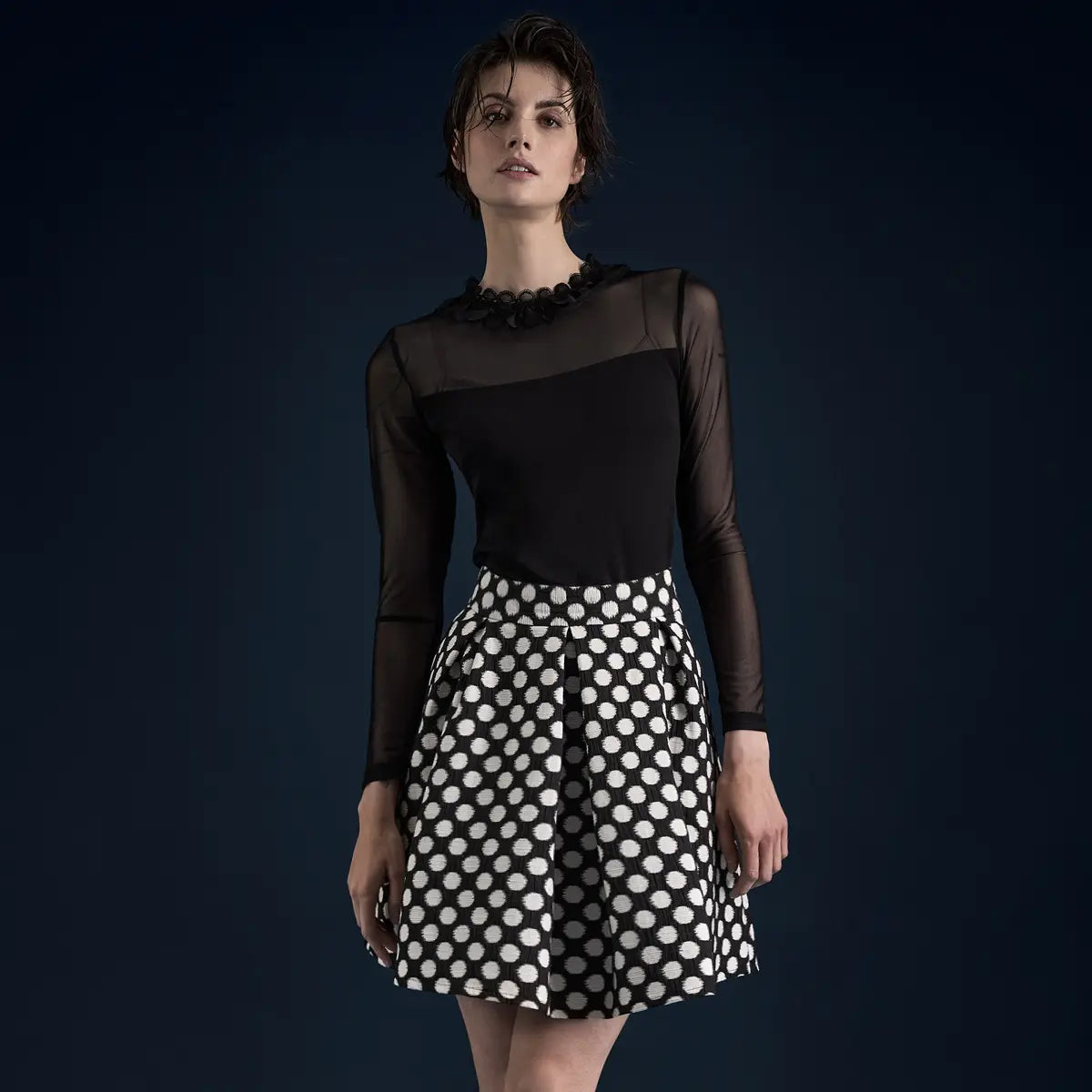
As so-called "non-colors," black and white are primarily sources of contrast. Both are associated with purity and a new beginning, but also with nothingness. In the West, white is the color for weddings and baptisms; in Asian cultures, it is worn at funerals. Black, the absence of light, exudes confidence and elegance—and that is precisely why it makes every other color shine.
Gray
Gray is the epitome of understatement: Understated, elegant, and reserved. It comes across as neutral and professional, but in too large a quantity, it can also seem aloof. Its strength lies on the stage—gray never overshadows anything and allows an accent color to really stand out. As a staple in your wardrobe, it goes with everything.
Earth tones
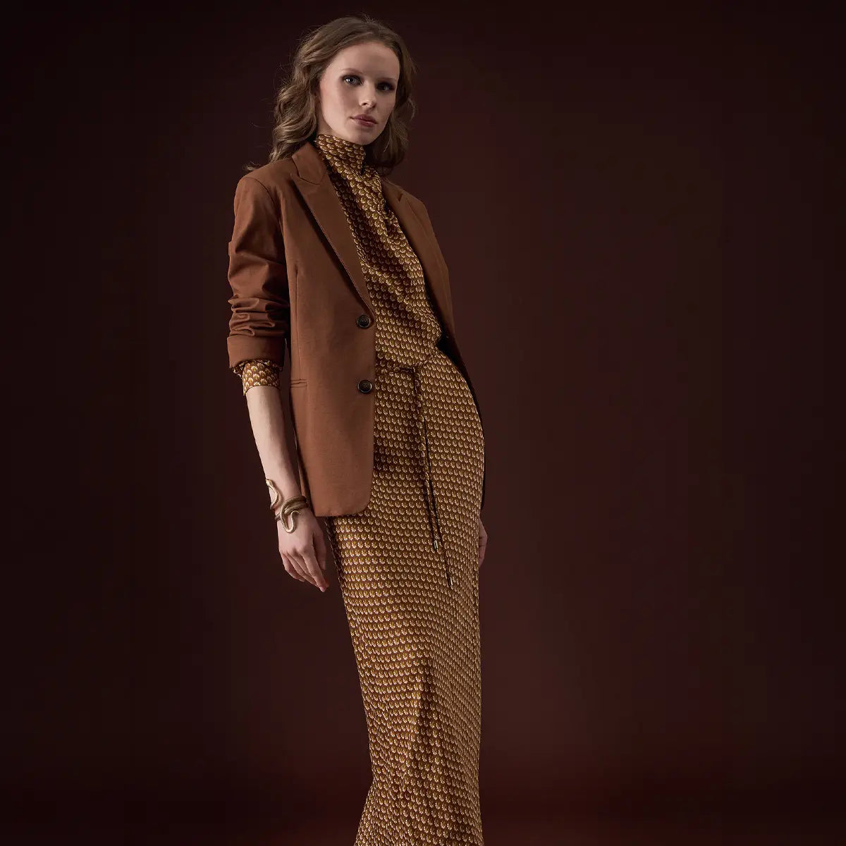
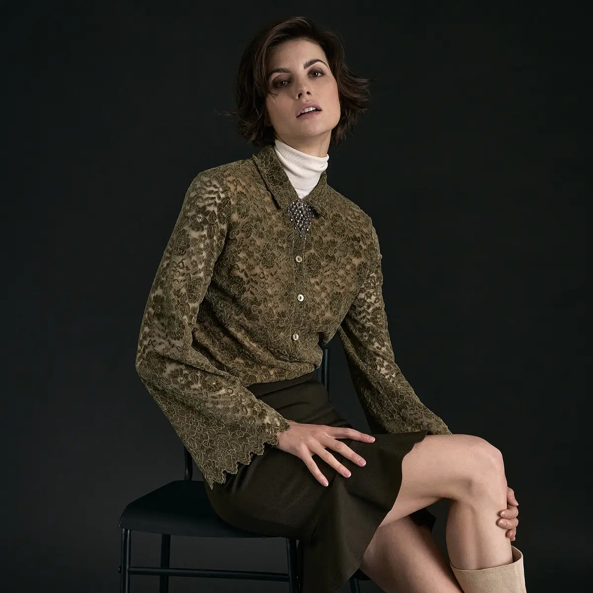
We perceive ochre, brown, and beige as natural, unassuming, and pleasant because they occur most frequently in nature—in soil, wood, and dry leaves. It’s no coincidence that they’re used in camouflage clothing: in beige or brown, you blend into the background. In living spaces and outfits, earth tones have a calming effect and evoke the feeling of a natural environment.

Black exudes confidence and makes every other color shine. @AI Illustration
in Pastel Shades
Pastel shades are lightened, desaturated colors—they retain their impact, but are more subdued. They symbolize tenderness, romance, and lightness, and are the classic spring and summer shades. If you like soft, playful colors, lilac, mint, or powder pink are the perfect choices: Pastel shades have a calming effect without being boring.

Pastel shades evoke a sense of lightness and springtime freshness—the same effect, just more subtle. @AI-Illustration
Which color for which occasion?
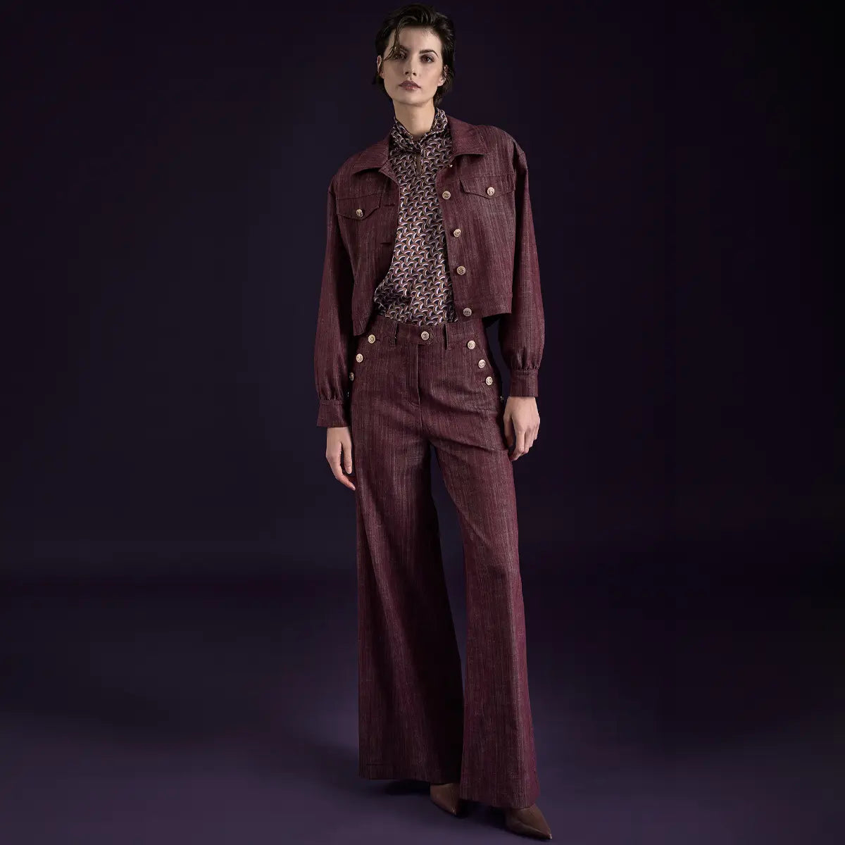
Color psychology comes into play when choosing an outfit. If you want to project confidence, go with blue— the professional choice for a job interview. If you want to stand out, go with pink or red. Black and gray work well for a confident business look, while earth tones are ideal for a relaxed, natural look. That’s how a feeling becomes an outfit.
From Red to Black—Stunning Looks That Make a Statement
: Styling Dos & Don'ts
Choose colors based on the desired effect —blue for calm, red for presence
Combine neutral base colors (black, gray, beige) with an accent color
Use complementary contrasts intentionally if you want to stand out
Body-positive thinking: Colors should accentuate and create balance, not “conceal”
Don'ts
Don't wear several bright, bold colors at the same time —it makes the look too busy.
Don't view the effects of color as dogma: Context and culture also play a role
No sweeping superlatives (“the best color”)—the effect varies from person to person
My conclusion: Colors are never just decoration. They help shape how we feel and how others perceive us. If you understand their impact, you can use them intentionally—in your space, in your daily life, and especially in your own wardrobe. In the end, only you know which color suits you best today. Wear your story.

Green symbolizes balance and a new beginning—captured in passing. @AI illustration
Fun Facts & Interesting Information
- Baker-Miller Pink (“Drunk Tank Pink”) has beenshown to reduce aggression—hence the pink prison cells.
- Blue is the only color that has positive connotations in every culture.
- Red stimulates the appetite —one reason why so many fast-food logos are red.
- Surgical gowns are green: As the complementary color to red, green is easy on the eyes.
- True purple was once more expensive than gold —hence the “royal” aura of violet.
- Black makes you look taller—the slimming effect is based on a real psychological phenomenon.
- Orange is the most recent color name in German —named after the fruit.
You Ask, We Answer – Frequently Asked Questions About the Effects of Colors
What is color psychology?
Color psychology examines how colors influence emotions, perception, and behavior—partly through psychological effects and partly through cultural influences.
Which color has a calming effect?
Blue and soft pastel shades have a calming effect; pink has also been shown to reduce aggression.
Which color boosts self-confidence?
Pink and purple radiate self-confidence, while black conveys a sense of confidence and clarity.
What color represents trust?
Blue—it conveys a sense of professionalism and is the safe choice for situations where you want to build trust.
What color should you wear to a job interview?
Muted, confidence-inspiring shades like navy or blue, complemented by neutral basics like gray or black.
Is color psychology scientifically proven?
Some effects are well documented (such as the calming effect of certain shades of pink), but much of it is culturally influenced and varies from person to person.

Viviane Rittersporn
Since 2004, I have been working as an online editor for various blogs, magazines, and publications focusing on fashion, lifestyle, and travel. I have been contributing my expertise to the Ana Alcazar team since 2011. At Ana Alcazar Magazine, I am responsible for identifying topics and strategically revising content.
Between Image and History
Sometimes a story needs more than a photo can convey. That’s why some of the images in this article were created using artificial intelligence (AI)—curated, inspiring, and always in the spirit of “Wear your Story.” The AI-generated images are clearly labeled next to each photo.