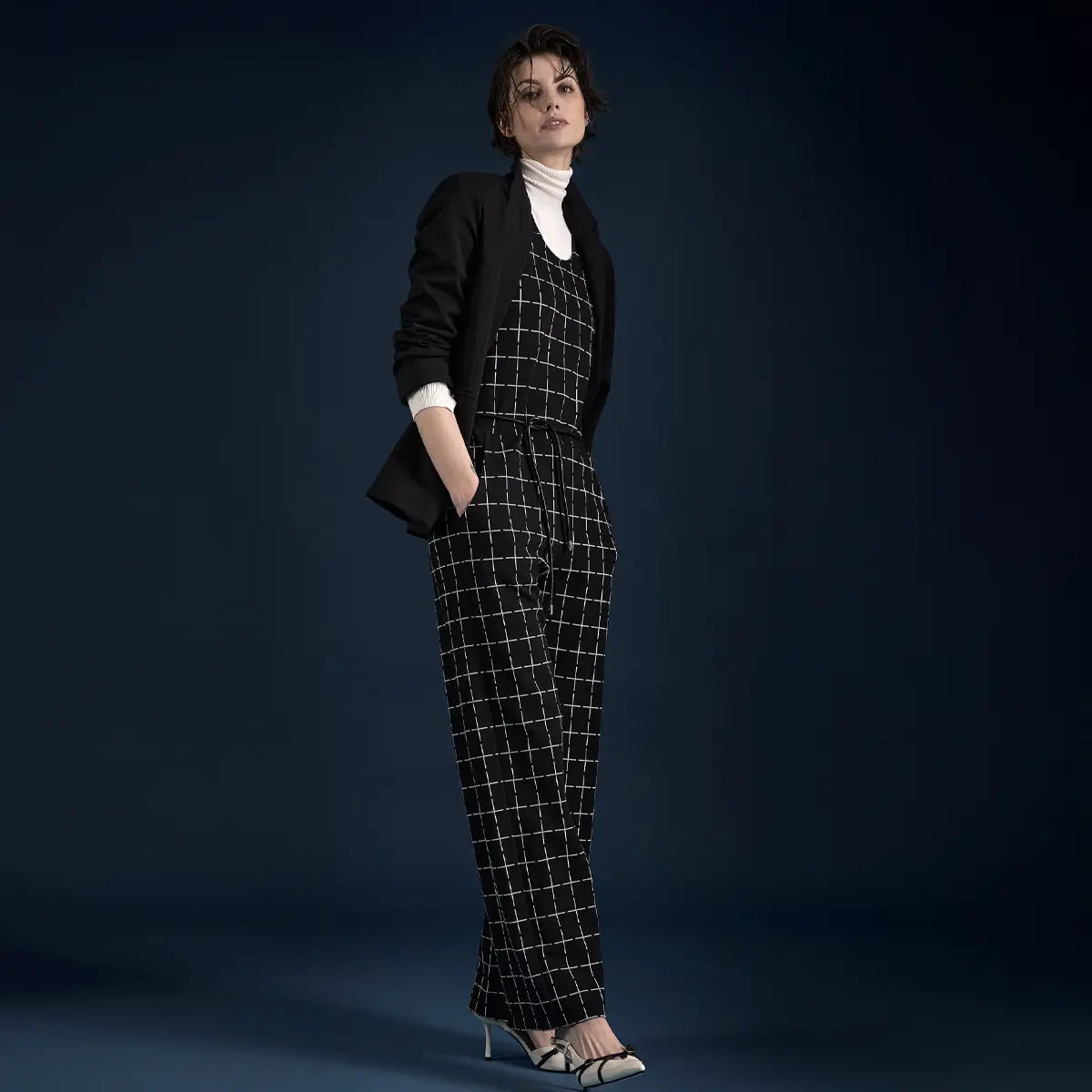


Maybe you remember that legendary, sarcastic comment by Miranda Priestly from the fashion movie *The Devil Wears Prada*. She wanted to describe the supposed lack of originality in fashion trends—because pastel colors keep coming back. Well, pastel colors are indeed a timeless classic that have been with us since the 1950s, but not just in the spring. They’re with us all year round.
In this guide:
What Are Pastel ColorsThe Effect of Pastel Colors on Your Look Who looks good in pastel colorsBasic rules for combining pastel colors Mixing Pastels (Interactive) Black and pastels—a good ideaPopular Pastel Combinations How to style pastel colors correctly Pastel Colors by Season Dos and Don’ts of Pastel Styling Frequently Asked Questions About Pastel Colors
What are pastels?
Mint, lilac, and baby blue make the wearer look feminine and exude a sense of lightness and freshness. Pastel shades will be a staple of street style again this year—whether as a head-to-toe tone-on-tone look or in unexpected combinations. All pastel shades have one thing in common: They have low saturation and a high proportion of white. This is how the light, delicate shades are created. They are the muted versions of rich, bold tones, achieved precisely by adding white.
What kinds of pastel colors are there?
An overview of the most important shades—from warm and sunny to cool and dreamy.
Rosé
#F4D4D4
Romantic, tender, warm
Apricot
#F0B58A
Soft, warm, velvety
Pastel yellow
#F4E394
Sunny, optimistic
Mint green
#B8E0CE
Cool, modern, fresh
Baby Blue
#A5C8E4
Lighthearted, easygoing
Lilac
#C99FCF
Dreamy, elegant
's Most Important Pastel Colors
Rosé: The quintessential pastel shade. This delicate, warm shade of rosé—with a high proportion of white and a hint of red—has a reputation for being romantic and playful. But especially when paired with rock-inspired or edgy pieces, rosé can have the opposite effect and come across as very cool.
Mint green: This cool, bright green with a slightly bluish undertone reminds us of mint. This understated alternative to the more eye-catching pastel colors adds a modern touch, especially when paired with white or beige.
Lilac / Lavender: Calm, dreamy, elegant—this light violet with subtle hints of gray and blue. This shade really stands out when worn as a complete outfit, but it also makes a statement when used as an accessory.
Light Blue / Baby Blue: Airy, cheerful, and light as a cloudless sky—baby blue, with its signature touch of “summer freshness,” has an easygoing and feminine feel.
Pastel yellow: Sunny, warm, and cheerful—this soft yellow adds warmth and a cheerful touch to any look. It flatters warm skin tones especially well and pairs beautifully with other fresh pastel shades.
Peach / Apricot: Soft, warm, and velvety—Apricot combines warmth and freshness. It flatters warm skin tones, adds a springtime feel to any outfit, and pairs well with both delicate pastels and rich accent colors.
The Effect of Pastel Colors on Your Look
Modern lightness, just the right touch of softness—pastel colors give your outfit an incomparable flair. Compared to darker shades, they appear less harsh; on the other hand, they make even brown or black shine. Important to know: Clean silhouettes and high-quality materials make pastels look sophisticated, while too many playful, soft details can tip the look too far into the romantic. Pastels can have a rejuvenating effect and soften an outfit because the colors radiate freshness.

Ice blue with a clean silhouette—pastel tones instantly come across as sophisticated rather than playful. @AI-Illustration
Who looks good in pastel colors?
The good news is: Pastel colors really suit every woman —regardless of whether you have a fair or slightly tanned complexion. Still, there are some recommendations: For those with particularly fair complexions , rose, baby blue, or mint green are especially good choices. Warm pastel shades like apricot or pastel yellow make darker skin tones glow.
Basic Rules for Combining Pastel Colors
Pastel colors offer a wide range of possibilities for incorporating them into overall looks. One of the most stylish options is a tone-on-tone combination. That’s right. Ever since “Quiet Luxury” took the street style scene by storm, monochromatic looks in pastels like beige or nude have also been in the spotlight. No wonder, since the subtle elegance these outfits convey is unmatched. We effortlessly associate a beige two-piece set with matching accessories with sophisticated style.
But you can also create eye-catching outfits using pastel shades. The magic word is: Contrast. Off the top of our heads, we think of color pairs like soft pink and red, or pink and mint green—cobalt blue and mint, or lavender and fuchsia, also make great combinations. These color combinations are impossible to miss.
The trick: At least one color in your overall look should really pop—such as red or a highly saturated color. For example, pair peach with burgundy or khaki. Or complement a pastel yellow sweater with a dark brown skirt or olive green pants.
Combining Pastels (Interactive)
Hover your mouse over a color—and see what pastel looks like when combined with that color.
Give it a try: What color goes well with rosé?
Choose a color from the palette—and see right away how it looks.
Rosé
#F4D4D4
Tone-on-tone
Rosé
#F4D4D4
Apricot
#FBD2B0
Pastel yellow
#F5E5A0
Mint green
#B8E0CE
Baby Blue
#A5C8E4
Lilac
#C99FCF
Classic
Cream
#EFE4CA
Beige
#D4C5A8
Light Gray
#C0C2C8
Anthracite
#3C3D44
White
#FAFAFA
Black
#0A0A0A
Statement
Navy
#1F2A3A
Denim blue
#5B7B9A
Bordeaux
#6B1D2F
Emerald
#1F6B4D
Mustard yellow
#C9942E
Pink
#E83870
Black and Pastel — A Good Idea?
Be careful when pairing with black: Black creates the starkest contrast to soft tones —this calls for a keen sense of style. Depending on the combination, black can literally “overpower” these soft, complementary pieces. So it all comes down to balancing the individual pieces.
Black can transform your look: A floral dress in baby blue, worn with a black leather jacket, instantly takes on a romantic yet rebellious vibe. When used purely as an accessory, black is only a good idea if it’s also incorporated into the overall look. Otherwise, the choice seems random and disjointed.

Pink makes black shine—and softens the austere look. @AI illustration
Balance as a Benchmark
Harmonious outfits often follow the principle of balance. When soft pastel shades and neutral colors are combined in a balanced way, they create harmonious looks. Subtle shades like camel or brown go wonderfully with the soft palette. Alternatively, you can also pair pastels beautifully with white. White makes all pastel colors pop andcreates an easygoing vibe.
Materialsalso shape the look andplay a key role in creating the desired effect. They influence the style and determine the perceived quality. The right mix of different textures can give an outfit the depth it needs: chunky-knit wool paired with faux leather or viscose paired with knitwear are among the most exciting combinations.
Fabric Tip: How Pastel Colors Look on Different Fabrics
- Cotton or linen: Pastel colors have a soft, natural look
- Silk or viscose: Flowing fabrics lend soft shades a luxurious, elegant look
- Satin and shimmering textures: they add a modern touch and make pastel shades pop
- Knit or cashmere: symbols of high quality — ideal for mixing materials in an outfit
Popular Pastel Combinations
Pastel colors always play a role in fashion, and there are classic color pairings that frequently appear in street style and on the runways. Quite simply, because these combinations have stood the test of time.
Combining Soft Tones in a Classic Style
Pink and gray arethe perfect combination—even for business outfits. Nothing is polarizing, nothing is off-putting, and thanks to the gray, this duo combines a sense of professionalism and neutrality with a friendly touch of pink. Even in the fall or winter.
Mint and white goperfectly together, especially during the warmer months. A mint-colored two-piece set pairs perfectly with a white top—it’s rare to find a look with so much flair.
Baby blue and brown arealso a popular color combination. Pairing them with brown creates looks that are harmonious yet understated.

Baby blue meets cognac brown—harmonious, earthy, understated. @KI-Illustration
Boldly Combining Soft Tones
If you like to be a little more daring and want to make a statement, you can also turn heads with pastel shades.
Pink and mint green—hardly any other combination looks so fresh and carefree. Pink and mint green make for an eye-catching duo that looks lively and slightly sporty.
Yellow and pink make another bold combination . Try pairing pink pants with a yellow blazer, for example, and experience color blockingat its best. Does anyone still have any doubts about just how cheerful these soft tones are?
Perhaps the ultimate pastel combination: when paired together, yellow and lilac makethe perfect match. How about a baby blue summer dress with a lilac blazer? Or accessories and ballerina flats in lilac? The choice is yours.

Pink and mint, mixed in a sporty way—pastel colors work for streetwear, too. @AI-Illustration
Combining Soft Tones in a Monochromatic Palette
Complete outfits always make an impression. Her look is confident and sophisticated. A cream-colored jumpsuit with matching accessories looks just as elegant as a pastel yellow maxi dress paired with a color-coordinated blazer and pumps.

A pastel yellow maxi dress with a color-coordinated blazer and pumps – KI-Illustration: Tone-on-tone in pastel yellow – a complete look with attitude. @KI-Illustration
Discover dresses in pastel shades
How to Style Pastel Colors
There are many ways to incorporate soft tones into your look. Here are a few simple tips for putting together a stylish outfit:
Wear with neutral tones: Pair the Softies with neutral shades like white, cream, beige, gray, or taupe. They add a sophisticated touch to the look.
Use dark colors strategically: Brown, dark green, or burgundy help ground very light pastel shades.
Pay attention to your skin type: Cool pastel shades like lilac or baby blue suit cool color types, while warm pastel colors like peach are perfect for warm color types.
Avoid mixing too many "cute" elements: Ruffles, flounces, bows, ribbons, and decorative details in pastel colors can come across as too playful. So be sure to use them sparingly.
Focus on mixing materials rather than colors: Use the power of different textures—such as silk, knit, and faux leather—to add variety and depth to your outfit.
For a striking look — monochrome style: A cohesive look in a pastel shade gives a modern and high-quality appearance.
Work with Tailoring: Blazers, dress pants, or coats in pastel colors convey a sense of professionalism and modernity.
Choose accessories thoughtfully: Shoes in nude or metallic shades look more elegant than stark color contrasts.
Pastel Colors by Season
Even though soft tones are always in style, our preferences have a lot to do with our outlook on life.
Spring and Summer — A Desire for Lightness and Freshness
During the warmer months, monochromatic pastel looks work wonderfully—such asan all-ice-blue or all-lavender outfit paired with light-colored accessories. Sheer fabrics and flowing silhouettes emphasize the lightness of your summery pastel look.
Summer favorites include: Lilac, Sky Blue, Mint, Apricot, Powder Pink, Pastel Yellow

Flowing lilacs in the summer light—a sense of lightness for the warm season. @AI Illustration
Fall and Winter — Sophistication and Contrast
In winter, pastel colors really come into their own. The “heavier” the fabric, the more striking the soft hues appear. A pink wool coat or an ice-blue cashmere sweater exude a sophisticated charm, especially when paired with charcoal gray, brown, or even black.
Winter favorites include: Rosé, Sage/Lavender, Ice Gray, Powder Beige

Rosé Wool Meets Black – Pastel with Sophisticated Winter Charm. @KI-Illustration
A Quick Summary: Dos and Don'ts of Pastel Styling
Add balance to a light-colored outfit with neutral colors like beige
Create striking outfits with contrasts using complementary shades or rich colors
For monochromatic outfits: pair warm pastel colors with warm pastel colors and cool pastel colors with cool pastel colors
Pairing Pastel with Denim — The Effortless Look
In winter , opt for heavy fabrics like velvet, wool, or cashmere
Start with a single pastel piece
Apply subtle makeup for a fresh, natural look
Don'ts
Mix three or more pastel shades in one outfit
Add a touch of romance to your outfit with playful details or flattering cuts
Geometric patterns like checks or bold, large prints—or do you prefer floral designs or stripes?
Don't overdo it with black; stick with brown or dark gray instead
Combining Pastel with Neon
Choose fabrics that are too thin or have an unnatural sheen
Choose bold accessories, such as a red bag
My conclusion: Pastel colors are much more than just spring classics— they’re the secret all-rounders of your wardrobe. From delicate rosé to fresh mint green to sunny pastel yellow: each shade evokes its own mood. Soft, feminine, modern, and surprisingly versatile. With the right fabric and the right combination, pastels look sophisticated and never cheesy —even in winter, even in a business setting.
The secret: Pastel colors require balance. Either tone-on-tone for “quiet luxury” elegance, or a bold contrast (burgundy, khaki, red) to anchor the look. Pay attention to the undertones—warm with warm, cool with cool. Mix no more than two pastel shades, play with textures rather than too many colors, and avoid fussy details. This turns pastel into a statement that isn't cutesy, but rather modern and self-assured. And Miranda Priestly? She was just having a bad day back then.
Fun Facts and Fascinating Information About Pastels
- The word “pastel” comes from the Italian “pasta” —meaning “dough.” It originally referred not to a color, but to a painting technique: pressed pigment sticks made of color powder, chalk, and a binder. It was only through the characteristic soft, powdery effect of this technique that “pastel” became synonymous with “gentle, light, and delicate.”
- Marie Antoinette turned pastels into a status symbol —her famous “Petit Trianon” at Versailles was decorated entirely in pastel shades. After the French Revolution, pastel colors were therefore considered “too aristocratic” for decades and fell out of fashion.
- The “girls = pink, boys = blue” rule is a product of the pastel era —before the 1940s, the association was exactly the opposite (pink was considered a “vibrant boys’ color”). It was only through the mass production of baby clothes in pastel shades and targeted marketing campaigns that today’s convention emerged. Today, this norm is finally beginning to break down.
- As people age, the human eye tends to prefer pastel shades —with age, bright colors are perceived as unpleasant, while pastel shades are considered “easier on the eyes.” Brands such as Mercedes and Apple have deliberately incorporated this into their color schemes.
- "Pastel Goth" is a distinct subculture —originating in the early 2010s on Tumblr, it combines dark Gothic elements (skulls, spiders) with a light pastel background. It’s a small cultural revolution against the idea that pastels are “just cute.”
- Wes Anderson has made pastel colors his visual trademark —films like *The Grand Budapest Hotel* (2014) and *Asteroid City* (2023) have sparked a full-fledged fashion and interior design trend: the “Wes Anderson Aesthetic.” On TikTok, the hashtag has garnered over 2 billion views to date.
You Ask, We Answer — Frequently Asked Questions About Pastel Colors
What exactly are pastels?
Pastel colors are muted versions of bold hues—created by adding white. They have low saturation and a high white content, which results in light, delicate shades. Among the most important pastel shades are rosé, mint green, lilac, baby blue, pastel yellow, and apricot. Each shade has its own character—ranging from romantic (rosé) to elegant (lilac) to sunny (pastel yellow).
Can I wear pastel colors in the winter, too?
Absolutely—in winter, pastel shades really come to life through the fabric. The heavier the fabric, the more striking the soft tones appear. A pink wool coat, an ice-blue cashmere sweater, or a lilac-colored knit exude a sophisticated charm. Winter favorites like rosé, sage/lavender, ice gray, and powder beige work particularly well when paired with charcoal, brown, or just a touch of black.
Can I combine pastel with black?
Yes, but use it sparingly! Black creates the starkest contrast to soft tones—this calls for a delicate touch. A floral dress in baby blue paired with a black leather jacket instantly takes on a romantic-rebellious vibe. Important: Black should appear multiple times in the outfit (e.g., jacket and shoes), not just as a single accessory. If you prefer a more conservative look, choose brown or dark gray instead of black.
How many pastel colors can I wear at the same time?
You should use no more than two pastel shades in an outfit at the same time; otherwise, it can quickly look cluttered or candy-like. Tried-and-true combinations: rosé + gray (classic), mint + white (fresh), baby blue + brown (harmonious). For bold looks: pink + mint, yellow + lilac, or yellow + pink (color blocking). If you want an all-over look, it’s best to stick to different shades within the same pastel family—for example, rosé and soft apricot.

Christine Schmitz
My love for fashion and communication led me to Ana Alcazar—having cut my teeth as a copywriter and concept developer in traditional advertising, I’ve been writing for our Munich-based designer label for over 10 years. On the editorial team, I’m responsible for all corporate topics, and I also focus on current trends and my passion: gender equality.
Between Image and History
Sometimes a story needs more than a photo can convey. That’s why some of the images in this article were created using artificial intelligence (AI)—curated, inspiring, and always in the spirit of “Wear your Story.” The AI-generated images are clearly labeled next to each photo.