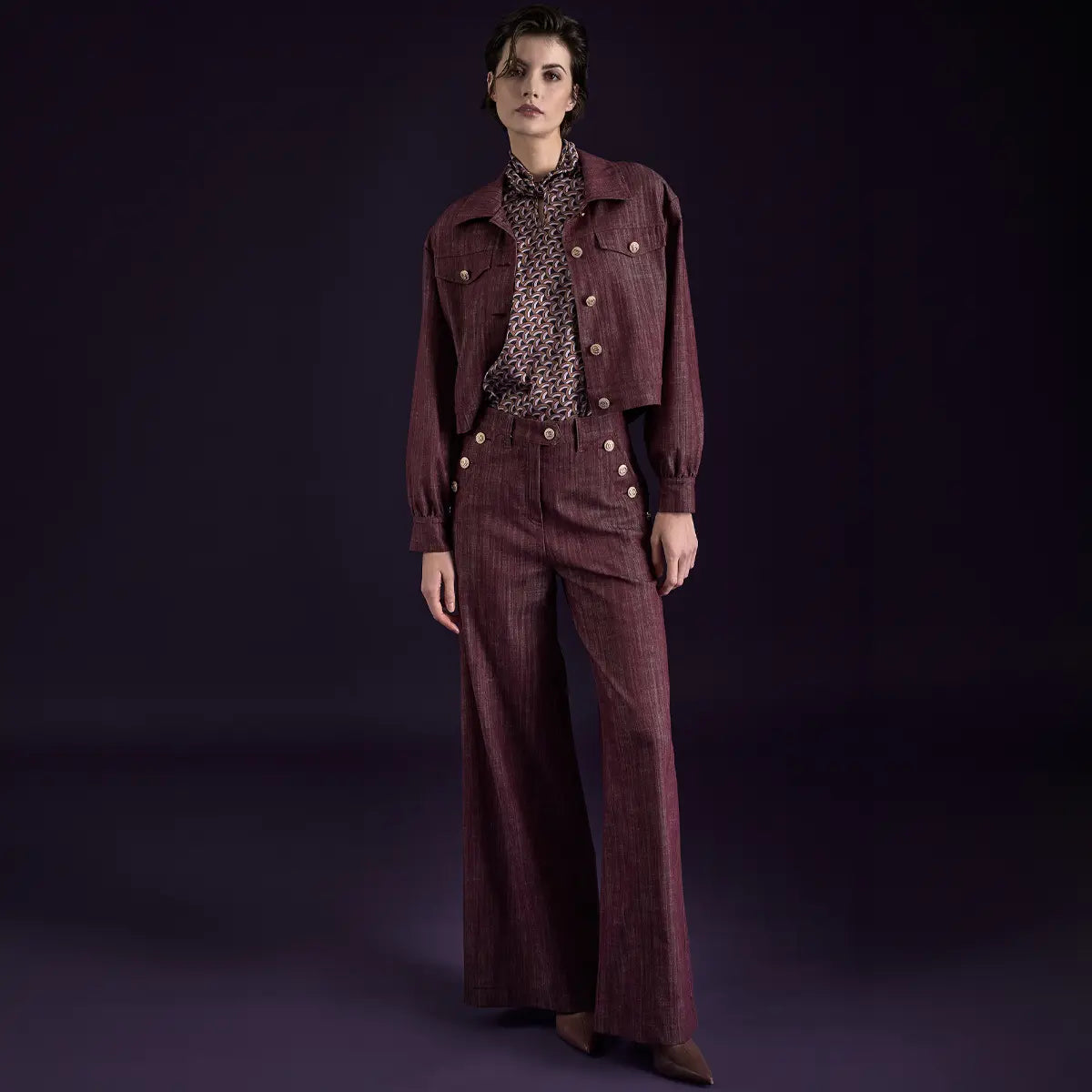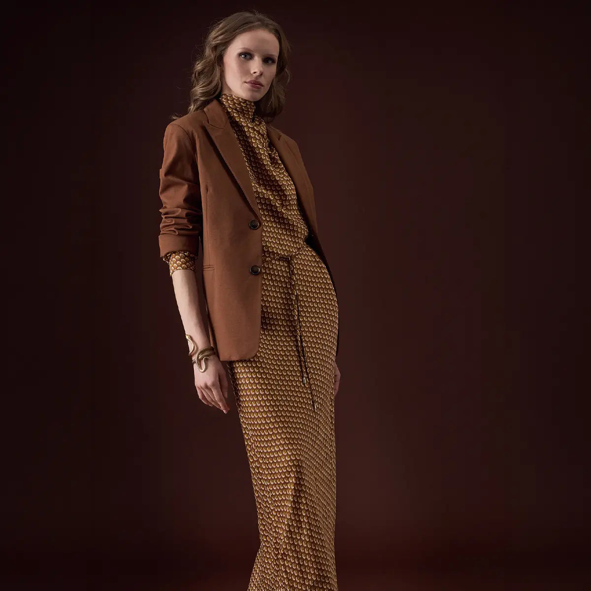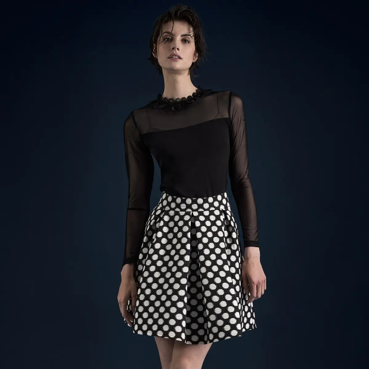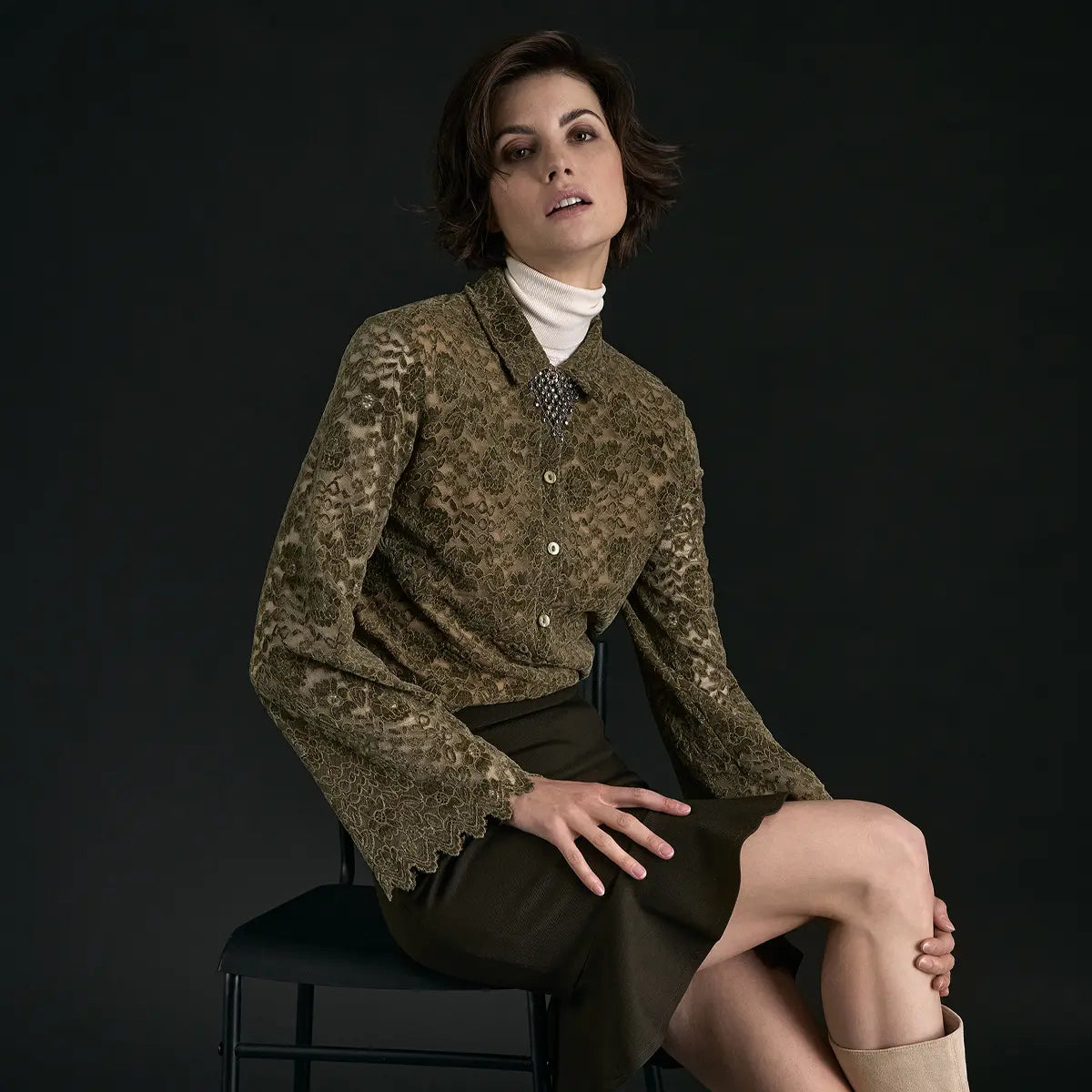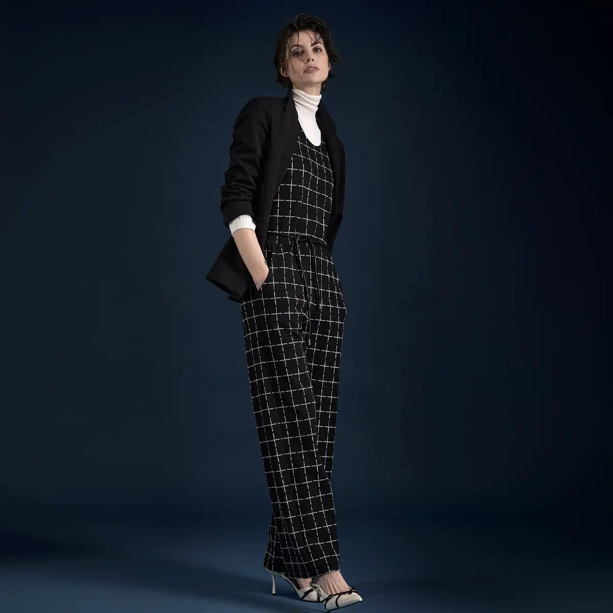


From powdery rosé to dusty pink to bold pink— pink is a true jack-of-all-trades, showcasing its versatility through a wide spectrum of shades. So it’s time to put an end to its purely soft image and recognize its potential. If you still think pink is just for romantics, these sophisticated combinations will amaze you.
In this guide:
What do we associate with the color pinkPairing Pink (Interactive) Who looks good in pinkWhich color type and hair color does it suitCombining individual shades of pink Color combinations we love Combining Pink Tone-on-Tone Dos & Don’ts for styling with pink Frequently Asked Questions About Combining Pink
What do we associate with the color pink?
The most romantic shade in the color spectrum—that’s the image of pink. It’s said to be the most feminine color of all. And because of that, it also divides opinion and is quite controversial. Not everyone likes pink; many find the shade kitschy or too girlish and naive. In particular, the socially established, one-sided notion that it is a color exclusively for girls has been rightly criticized and has contributed to this perception.
But did you know that? The color pink has very different meanings in various cultures. While here pink clothing is still primarily produced for girls, in the East (old) pink is considered a color of masculinity—as, incidentally, it was in our part of the world during the Renaissance. Pink is regarded as “little red” and thus as a color for all things masculine. Today, pink continues to be associated with attributes such as gentleness and romance.
What shades of pink are there?
The most important shades of the pink family—from a delicate hint to a bold statement.
Powder Pink
#F8E4E0
Delicate and romantic
Rosé
#F4D4D4
Soft and feminine
Dusty Pink
#E8B4B8
Classic and elegant
Coral Pink
#FA9DA8
Fresh and summery
Pink
#E83870
Powerful and courageous
Berry Pink
#9C4A6B
Deep and autumnal

Pink can be cool: a silk dress paired with a leather jacket. @AI illustration
Pink is a mixture of white and red.From a color psychology perspective, this is in itself an intriguing and contradictory combination: While white symbolizes purity and innocence, red stands for energy and passion. The more delicate the shade of pink, the more charming it appears. Bolder shades like hot pink can come across as provocative or—depending on the look—even seductively feminine. And even the often-maligned “Barbie style” has seen a resurgence in popularity, at least since the release of the empowering Barbie movie.
This delicate shade of pink, with plenty of white in it, evokes a sense of softness and is said to have a calming effect, promoting serenity and relieving tension. With its carefree lightness, it inspires and conveys optimism and hope— pink is the charming color of good cheer.
Pink is …
tender, romantic, compassionate, caring, hopeful, warm, full of love, gentle, understanding, feminine, youthful, intuitive, empathetic
But also …
naive, immature, girlish, fragile, cheesy, weak-willed, clichéd
How to Style Pink—Try It Out Live
Hover your mouse over a color—and see how pink looks when combined with that color.
Give it a try: What color goes well with pink?
Choose a color from the palette—and see right away how it looks.
Pink
#E8B4B8
Tone-on-tone
Powder Pink
#F8E4E0
Rosé
#F4D4D4
Dusty Pink
#E8B4B8
Coral Pink
#FA9DA8
Pink
#E83870
Berry Pink
#9C4A6B
Classic
Cream
#EFE4CA
Camel
#C9A88A
Light Gray
#C0C2C8
Anthracite
#3C3D44
White
#FAFAFA
Black
#0A0A0A
Statement
Navy
#1F2A3A
Denim blue
#5B7B9A
Emerald
#1F6B4D
Mustard yellow
#C9942E
Bordeaux
#6B1D2F
Purple
#7B3F8F
Who looks good in pink?
Most women look feminine and elegant when dressed in shades of pink. It always depends on the combination that suits your body type and the specific shade of pink—because not all pinks are the same. There’s a perfect shade for every body type. Delicate rosé tones have a softening effect and flatter nearly all skin tones.

Pink, mint, and a pop of orange: color-blocking with a summery vibe. @KI-Illustration
What color type and hair color does it suit?
If you choose the right shade, pink will definitely look good on you. This applies to:
Are you a winter type? Then cool, clear shades of pink are ideal for you—the icier, the better.
Are you a summer type? Go for cool shades of pink—especially pastel and powdery ones.
Are you a spring type? A powdery pink with a hint of yellow flatters you the most.
Are you an fall type? Go for a warm apricot-pink.
Good to Know
Not all pinks are the same. The key difference lies in the undertone: a cool pink with a blue cast belongs in a different fashion world than a warm apricot pink. Place two shades of pink side by side before you pair them—the undertone will tell you which one goes best with the other.
on how to combine individual shades of pink
Pink comes in many shades: a wide variety of cooler, warmer, bolder, or more powdery tones; nude shades that lean toward pink-beige; or pink with a bold, vibrant high red content. That’s why pink is so versatile—it pairs well with both neutral tones and other accent colors. But it can also be used to create extravagant looks with bold colors. And by the way: Pink can come across not only as “romantic,” but also as serious, elegant, or extravagant.
What colors go well with powder pink/light pink?
Powder pink is the color Barbie wears, too. Not all of us would opt for an entire outfit in this shade. But when paired with various shades of gray, such as stone gray or dark gray, a pink shirt suddenly looks very grown-up. This subtle shade provides the perfect backdrop and creates a great contrast to the pink hue. How about a pink blouse and a slim-fit blazer in gray or charcoal for your next business meeting? If you want to emphasize a sweet, feminine look, choose mint or denim blue, or pair it with white to create a spring-like, feminine look.

Powder pink and charcoal gray—that’s how pink becomes business-appropriate. @AI Illustration
What colors go well with dusty pink?
Dusty pink is a blend of red and white with black. The higher the proportion of black, the more refined and elegant it appears. That’s why black also pairs well with it. But green or gray also emphasize the sophisticated character of this shade. If you want to highlight the soft side of dusty rose, pair the garment with light colors such as white, cream, or beige. White, as well as gold and natural tones, also harmonize beautifully with this inviting shade of dusty rose.

Dusty pink and black: elegant, understated, year-round. @AI illustration
A Little Primer on Rosa
- If you add a strong contrast to pink, its “childlike charm” is put into perspective.
- The strongest contrast is created when black is part of the outfit. Depending on your skin tone, this can look too harsh.
- In that case, it's better to opt for gray to achieve an elegant, balanced overall look.
- A much-loved classic, especially in the summer, is the combination of white and pink—for a fresh outfit.
What colors go well with pink?
Pink is the boldest shade of pink, and with its high red content, it’s impossible to miss. Head-to-toe looks instantly grab attention. And pink is perfect for stylish color-blocking. Pink and orange are a combination that’s impossible to miss and features prominently in many collections. Just as expressive and equally popular is the pairing of pink and red. How about a red top with pink pants? Pink and green complement each other as complementary colors, and that’s exactly what makes an outfit like this so interesting. For fresh outfits, white or beige paired with pink works well—these neutral base colors give pink an elegant touch.

Pink and white: a neutral base, an elegant look. @AI illustration
Good to Know
The darker the contrast, the more mature the pink look appears. Black takes pink out of the “girly” category, gray makes it suitable for business, and white makes it pop. That’s the most important rule for styling with pink.
Color combinations we love to see
Anyone who thinks that pink always looks girlish and playful is sorely mistaken. Because—when styled right—it can look stylish, mature, and confident.
Combining Pink & Beige
Warm beige and pink exude style. When neutral beige takes center stage, it’s paired with pink. Stylish, feminine, and timeless: pair beige pants with a pink top. The warm shade shines subtly in the background, while your favorite pink pieces can really shine. Perfect for a feminine look that also feels sophisticated.

Beige pants, pink top—beige in a supporting role, pink in the spotlight. @AI-Illustration
Combining Pink and Red
Far from a dreamy shade of pink, this is a combination that really packs a punch! Red and pink. These two shades create a monochromatic harmony —after all, both colors are on the same branch of the color wheel. This dream team captivates with its unmistakable color-blocking effect. The high-contrast colors harmonize perfectly with each other and, when combined, exude elegance, lightness, and freshness on mini dresses, jumpsuits, or as a coordinated outfit with a midi skirt and blouse. Whether it’s summer or winter, whether you’re blonde or brunette, this combination is a winner!

Pink, orange, a pop of red: color blocking that really stands out. @KI-Illustration
Combining Pink & Purple
In principle, this is a good combination— but it all comes down to the subtle balance of the color shades. For a subtle color contrast, you can combine purple with soft shades of pink. Bright shades of pink create a stronger, yet equally harmonious contrast. Make sure your look doesn’t come across as too girly.

Pink and Purple: Subtly Coordinated Rather Than Girly. @AI Illustration
Combining Pink and Gray
When paired together, gray and pink look modern and stylish. Gray on its own can quickly look dreary and too stark, but adding a touch of pink makes it shine with a warm, inviting glow. For any outfit with a classic vibe, you can always pair light pink with gray and navy blue. It’s a safe choice.

Pink Brings Gray to Life—the Safe, Modern Choice. @AI Illustration
Combining Pink & Blue
When combining pink with shades of blue, the intensity makes all the difference: If you prefer a bit more contrast, go for bolder shades of both colors. Make sure the two sounds don't compete with each other, but rather complement each other. For example, you can pair a bold royal blue with a soft pastel pink. Pink and blue, on the other hand, are a real power duo.

Pastel pink and royal blue: the power duo. @KI-Illustration
Combining Pink and Green
Not afraid of color? Then this is the perfect blend for you. Green and pink are an unusually exciting combination—not just in the summer—that often has a vintage feel. From lime green to emerald green to olive green—your patterned dress or your shorts-and-blouse combo in shades of pink and green will always add a stylish touch.
Tip: The earthy shade of green known as olive—which we’re familiar with from military style—is an unexpectedly exciting pairing with pink. Just give this “tough-and-soft mix” a try!

Tough meets soft: olive-khaki under a pink trench coat. @KI-Illustration
Monochrome Chic: Pairing Shades of Pink
Guaranteed to turn heads! A monochromatic pink outfit needs to be put together with care. If you prefer a more subtle look, pair shades of pink with a high proportion of white—such as cool blush or warm rosé. This creates elegant all-over looks or casual styles. Fashion-forward individuals opt for bold shades of pink, such as cool pink or coral, to make a fashion statement.
Tip: The cut of a dress or jumpsuit can also help create a cooler pink look. Choose clean, simple cuts for your outfit— without romantic details like lace and ruffles—and put together a sleek, streamlined look.

Pink and Red: Monochromatic Harmony with a Color-Blocking Effect. @KI-Illustration
Discover pink dresses
A Quick Summary: Dos and Don'ts of Pink Styling
Here are the most important rules of thumb at a glance—first, what you should do, and second, what you should avoid:
Not every shade of pink suits every woman —choose based on your color type: cool for Winter & Summer, warm for Spring & Fall
For monochromatic outfits, wear no more than three different shades of pink together
Add subtle accents with light color combinations for an extra touch of elegance
Subtle, well-balanced looks require balance: Gray, white, or black in a color mix
For high-impact outfits, choose pink and add bold contrasts like blue
How to Style Color-Blocking: Pink & Orange or Pink & Red for a Wow Effect
A skillful mix of materials adds excitement to tone-on-tone outfits
Incorporate the "Rosaton" shade into your makeup — choose a lipstick or blush in the same shade
Don'ts
Mix warm and cool shades of pink in monochromatic outfits
Set the occasion aside: bold contrasts or rich shades for business meetings
A wild mix of patterns in complementary colors — just too much!
Wearing too many statement accessories with pink —the color speaks for itself
Create "candy-colored" looks without contrasting pieces like boots or a leather jacket
Inappropriate makeup with additional shades of pink
Combining bows and too many ruffles
Wearing white ankle boots with pink dresses
My conclusion: Pink is the underrated adult among colors. If you set aside the clichés of Barbie and romance, you’ll discover a versatile color with an incredible range of facets —from sophisticated and elegant in dusty pink and gray to bold and powerful in pink and red.
The secret: Contrast makes all the difference. Black takes pink out of the “girls’ corner,” gray makes it business-appropriate, and white gives it a fresh look. If you’re bold enough to try color-blocking, pair pink with orange or red to instantly create statement looks. Pink isn’t just a color —it’s a mindset.
Fun Facts and Fascinating Information About Rosa
- Schiaparelli invented “Shocking Pink” in 1937 —Italian designer Elsa Schiaparelli created her provocative bright pink as a deliberate statement against Chanel’s elegant restraint. The “Shocking” perfume, with its garish pink hue, became a fashion revolution.
- In Thailand, each day of the week has its own color —and pink is the color of Tuesday. The late King Bhumibol was born on a Tuesday, which is why Thailand was bathed in pink for weeks in 2006 when he was discharged from the hospital.
- "Baker-Miller Pink" calms aggressive people —in the 1980s, U.S. prisons painted individual cells a specific shade of pink because studies showed that it reduced violence and aggression. This trick was also used in some sports locker rooms (for the opposing team!).
- The 2023 “Barbiecore” trend brought pink back to the couture stage —Valentino even launched its own Pantone color, “Pink PP.” In the summer of 2023 alone, sales of pink clothing rose by 416%.
- Millennial Pink was one of the most influential colors of the 2010s —this pale, slightly grayish pink dominated Instagram, cafés, brand packaging (Glossier!), and interior design starting in 2016. It was described as “the first democratic color of social media.”
You ask, we answer — frequently asked questions about pairing pink
What is the complementary color to pink?
The complementary color of pink is a spring-like green. Pink and green are opposite each other on the color wheel and enhance each other. This combination occurs all the time in nature—the rose is the best example. It gets especially interesting when you combine muted and pastel shades, such as olive green with rosé.
How can I wear pink as an adult without looking too girly?
Three Rules: First, go for bold contrasts—black, charcoal gray, or dark blue instantly take pink out of the “girly” category.
Second, choose clean, simple cuts without ruffles, frills, or lace.
Third, think about the fabric: silk, wool, or leather look more grown-up than tulle or chiffon. A leather jacket paired with a pink dress instantly makes any look cool.
Which shade of pink looks good on me with dark hair?
Vibrant shades of pink work especially well with dark hair—pink, fuchsia, or magenta create an exciting contrast and make your complexion glow. Dusty pink with a higher black content also looks elegant with dark hair. More subdued pastel shades like powder pink can sometimes look washed out on very dark hair.
Can I really wear pink to work?
Yes, absolutely. The trick is in the combination: A powder-pink blouse paired with an anthracite-colored blazer looks both professional and feminine. Dusty pink paired with black or dark blue is also appropriate for business settings. Just avoid bold shades of pink with color-blocking for meetings—those are better suited for after-work events.
What shades of pink should I have in my wardrobe?
The five most important shades of pink are: powder pink (delicate, spring/summer), dusty pink (elegant, year-round), rosé (neutral, easy to pair), pink (statement, bold look), and coral (summery, fresh). With these five, you’ll have the perfect option for every season and every occasion.

Christine Schmitz
My love for fashion and communication led me to Ana Alcazar—having cut my teeth as a copywriter and concept developer in traditional advertising, I’ve been writing for our Munich-based designer label for over 10 years. On the editorial team, I’m responsible for all corporate topics, and I also focus on current trends and my passion: gender equality.
Between Image and History
Sometimes a story needs more than a photo can convey. That’s why some of the images in this article were created using artificial intelligence (AI)—curated, inspiring, and always in the spirit of “Wear your Story.” The AI-generated images are clearly labeled next to each photo.