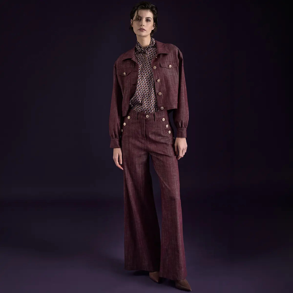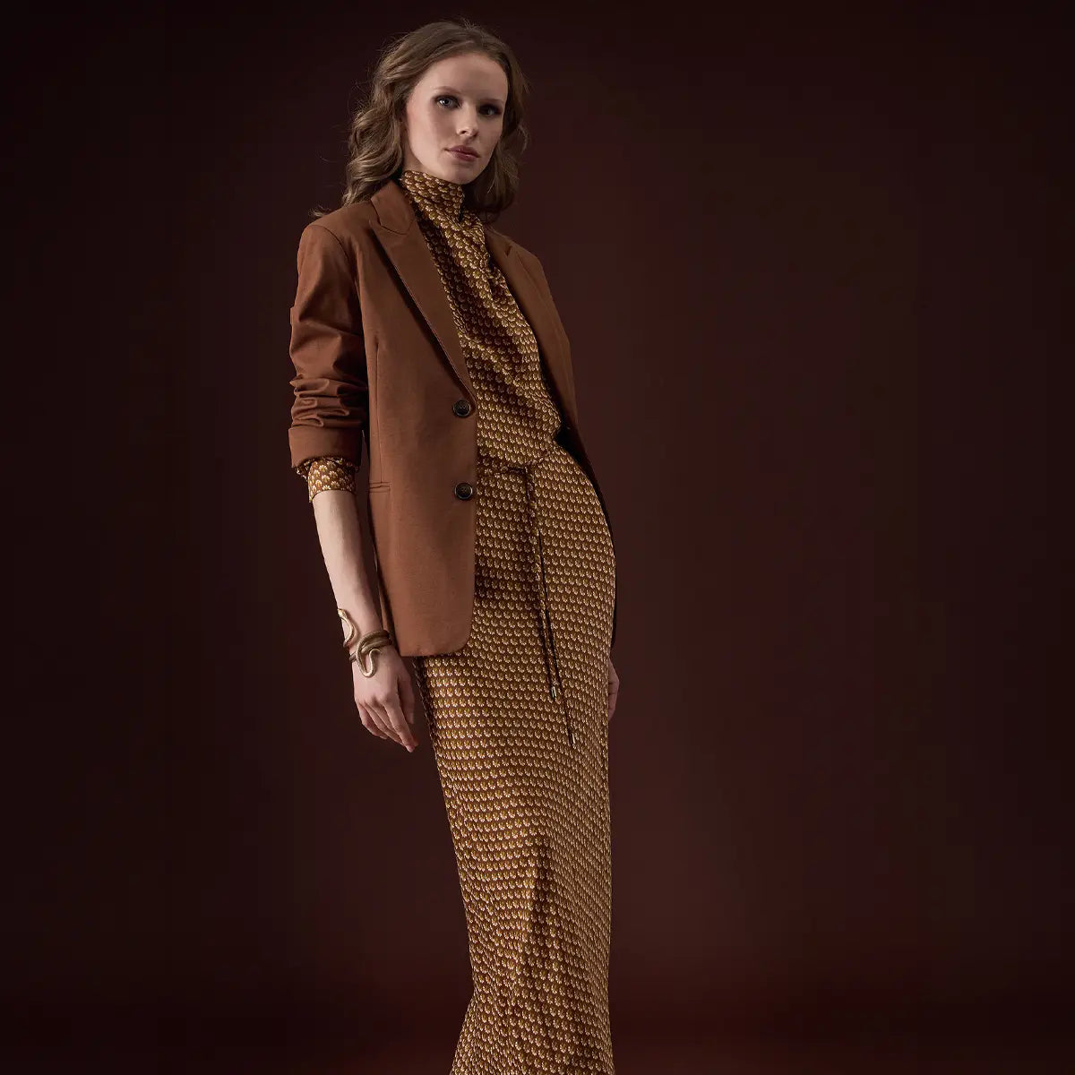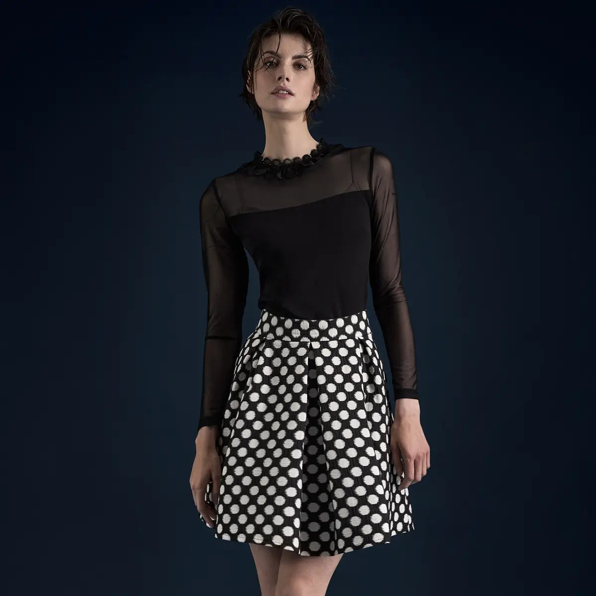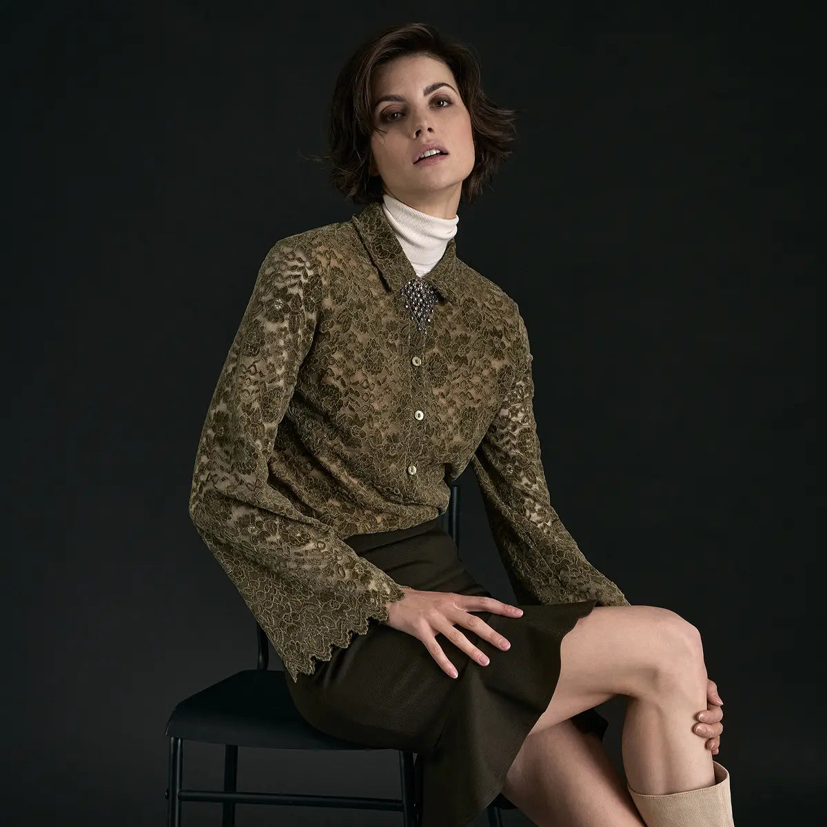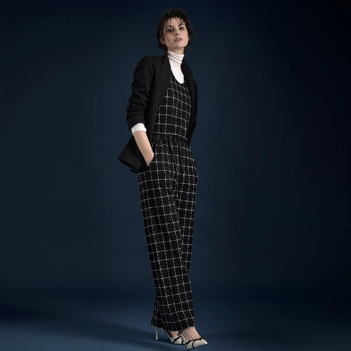


Fall is finally here again! It’s time for cozy socks, scarves, and a good book—and, of course, for our absolute favorite color palette: bring on the muted tones, with cinnamon brown and vermilion, with ochre and orange. Bright colors are out; instead, we’re snuggling up in muted tones. Want to know the best way to style them? Find out here!
In this guide:
What are muted colors?
Muted colors are, in a sense, the opposite of so-called bright colors. Where bright colors are vibrant and radiant, muted colors are matte and understated. When people talk about muted colors in fashion, they usually mean warm and soft tones—not the typical primary colors like red, blue, green, and yellow.
Muted colors are, therefore, “intermediate colors”; they fall within the color spectrum between the vibrant primary colors and are often toned down with white, gray, or beige—which is why they are often referred to as subdued colors.
What muted fall colors are there?
The key nuances of the dark, muted color palette—ranging from warm and earthy to cool and elegant.
Terracotta
#C4623C
Warm, earthy, iconic
Mustard yellow
#C9942E
Golden, spicy, sunny
Cinnamon Brown
#6F4423
Deep, spicy, cozy
Olive green
#6B7240
Close to nature, elegant
Gasoline
#1F5E6B
Cool, mystical, elegant
Wine red
#6B1D2F
Classic, festive, elegant
Which shades are considered muted colors?
While muted colors aren't as bright and vibrant as summer's bold hues, their variety is hard to beat. While light, muted colors—that is, all powdery pastel shades with white undertones, such as baby blue, lime green, and rosé—are more suited to spring, the dark, muted color palette with gray and beige undertones is perfect for fall.

The full spectrum of fall—terracotta, mustard, and olive, tone-on-tone. @KI-Illustration
Classic light, muted colors
Vanilla, Ecru, Lime Green, Pistachio, Mint, Rosé, Peach, Salmon, Flamingo, Lilac, Baby Blue, Aqua
Tip: These light, muted colors overlap with the pastel color family. If you’re interested in these shades, you’ll find more styling tips in the pastel colors guide.
Classic dark, muted colors (fall palette)
Ochre yellow, mustard yellow, terracotta, vermilion, wine red, plum, mauve, cinnamon brown, chestnut brown, taupe, olive green, jade, emerald green, blue-gray, petrol
This color palette will be the focus of the rest of this article —because it is at the heart of muted fall fashion.
Combining Muted Fall Colors (Interactive)
Hover your mouse over a color—and see how the muted fall shade terracotta looks when paired with that color.
Give it a try: What color goes well with terracotta?
Choose a color from the palette—and see right away how it looks.
Terracotta
#C4623C
Tone-on-tone
Ochre yellow
#C9942E
Mustard yellow
#A88420
Cinnabar Red
#B83A1F
Wine red
#6B1D2F
Cinnamon Brown
#6F4423
Olive green
#6B7240
Classic
Cream
#EFE4CA
Beige
#D4C5A8
Camel
#C9A88A
Taupe
#A89888
Anthracite
#3C3D44
Black
#0A0A0A
Statement
Cobalt Blue
#1840A0
Emerald
#1F6B4D
Gasoline
#1F5E6B
Pumpkin orange
#E07A3C
Ruby Red
#9C1F3C
Purple
#7A4A8C
The Perfect Fall Outfit in Muted Colors
Of course, the play of colors that nature puts on in the fall is hard to beat, but we can come a little closer to Mother Nature by styling ourselves in the most beautiful warm colors this fall. The muted colors of fall simply match the mood of this season perfectly: Fog gray, pumpkin orange, sea green, and chestnut brown arethe colors of the season and can be beautifully combined with one another. To style your outfit in muted colors perfectly, all you need is a little finesse and our four tips:
Tone-on-tone
Simply put together your muted fall outfit like a layer cake—that is, tone-on-tone. Using colors from the same color family creates a harmonious look that’s absolutely stylish —precisely because of its apparent “monotony.” Choose a muted color, such as blue, green, or orange, and coordinate the individual pieces of your outfit within that color spectrum.
Here are some examples: pants, tops, and accessories in petrol blue, dove blue, and navy blue; in coral red, wine red, and rust red; or in fir green, olive green, and lime green.

Tone-on-tone like a layer cake—three shades of green from the same family. @AI-Illustration
Pro Tip
Non-colors such as white, black, and gray are the perfect companions for the tone-on-tone look and can either lighten up an outfit (white) or add depth (black).
Pattern Mix
Prints and patternsin muted colors are great because they look so understated. Unlike with bright colors, muted colors let you really go all out when it comes to patterns. Whether it’startanor stripes, leopard printor houndstooth —one or two patterned pieces will really elevate your fall outfit. If you’re having trouble mixing patterns, you can add wonderful accents with a patterned scarf!

A Subtle Mix of Patterns – Tartan Meets Subtle Knit, Very Understated. @KI-Illustration
Playing with Materials
The great thing about fall is that it’s cool enough to really make the most oflayering. Take this opportunity to create a truly varied outfit from a wide range of fabrics!
Wool, tweed, corduroy, and denim arethe perfect fabrics for fall and can be combined beautifully. These fabrics look best in muted colors!

Corduroy, tweed, and wool—fall thrives on the interplay of textures. @AI Illustration
Add highlights
In fashion, muted colors are often completely underrated—and unfairly so! It’s precisely these subtle shades that are wonderfully versatile and truly flatter everyone! However, it never hurts to spice upyour muted-color outfit with a little pop of color—and here’s how: Put together a look using pieces in soft shades of green, brown, beige, or gray, and pair it with an accessory or top in a bold color— preferably a complementary color!
For example, the combination of autumnal browns and greens paired with a ruby-red bag or a purple scarf works great. If you’re going for an outfit with blue denim and muted teal, an orange blouse or pumpkin-colored shoes are a perfect match!

Just one pop of color is all it takes—ruby red as a highlight in an earth-tone look. @KI-Illustration
Discover fall dresses at
A Quick Summary: Dos and Don'ts for Styling Muted Colors
Go for tone-on-tone looks — colors from the same family look especially elegant
Work with materials like wool, tweed, corduroy, and denim —layering is a must
Mixing patterns is allowed: Tartan, houndstooth, leopard print, and stripes look especially good in muted tones
Use a bold color as an accent— a complementary color is a great choice!
Use white, black, and gray as accent colors—they can lighten up or deepen the look
Wear gray as a stylish alternative to black or dark blue in a business setting
Capsule Wardrobe: Muted colors can be combined beautifully with one another
Don'ts
Combining too many bold accents— the accent loses its impact
Mix warm and cool muted tones at random—pay attention to the undertone
Combining muted colors with neon— the contrast doesn't look harmonious
Too many patterns at once — a maximum of two patterned pieces per outfit
Shiny synthetic fabrics — muted tones call for natural, matte textures
My conclusion: I’m a big fan of muted colors—they make up a large part of my capsule wardrobe because they pair so well with each other. Especially when styled with bold, statement pieces, they shed their understated nature and make a fashion statement perfect for fall! From terracotta to mustard yellow to olive green: muted colors are the secret stars of fall fashion.
The secret: Stick to the color family—warm earth tones work best together, while cool teal shades harmonize with one another. A mix of materials adds depth, and a strategic pop of color (ideally in a complementary shade) creates an eye-catching focal point. And the “non-colors”—white, black, and gray—are the reliable companions that ground the whole look. This transforms a look that’s “just muted” into a well-thought-out, elegant fall style.
Interesting and Fascinating Facts About Muted Colors
- The term “Muted Colors” was coined in the early 1980s by Giorgio Armani —he revolutionized men’s fashion with “unaggressive colors” (in his own words): greige, taupe, and mud tones. Before that, fashion success was measured by bright, eye-catching colors—Armani turned muted tones into a symbol of true class.
- The Japanese “wabi-sabi” aesthetic favors muted colors —this centuries-old philosophy of “beauty in imperfection and simplicity” celebrates subdued earth tones and natural hues as the highest form of elegance. Today, this philosophy shapes brands such as COS, Uniqlo, and Jil Sander.
- Coco Chanel said of muted colors , “Black isn’t the only path to elegance. But beige? That’s elegance” —and by that she actually meant the entire family of muted tones. Her Parisian apartments were decorated entirely in subdued shades of beige, greige, and mud.
- Pantone has never named a “classic muted” color as its Color of the Year —all Pantone colors tend to be bold, statement shades (Marsala, Greenery, Living Coral, Viva Magenta). Muted colors are considered “too difficult to market” in the fashion industry because they defy trends. They are the timeless classics—the anti-trend trend.
- The concept of “Quiet Luxury” is based on muted colors —this trend, which has been ubiquitous since 2023 (The Row, Loro Piana, Khaite), is essentially a direct revival of the muted-colors aesthetic. “If you’ve got it, you don’t have to show it” also applies to color: no garish hues, but rather greige, camel, and earthy tones.
You Ask, We Answer — Frequently Asked Questions About Muted Colors
What exactly are muted colors?
Muted colors are the opposite of bright, bold colors. They are matte and understated because they have been toned down with white, gray, or beige. In fashion, a distinction is made between light muted colors (pastel, spring-like—e.g., vanilla, lime green, mint) and dark muted colors (warm, autumnal—e.g., terracotta, mustard yellow, olive green, cinnamon brown). They are also referred to as “intermediate colors” or muted colors.
Which muted colors are best for fall?
The dark, muted color palette is perfect for fall: ochre yellow, mustard yellow, terracotta, vermilion, wine red, plum, mauve, cinnamon brown, chestnut brown, taupe, olive green, jade, emerald green, blue-gray, and teal. These shades harmonize with the mood of the season and can be beautifully combined with one another—whether as a tone-on-tone look or with strategic accents.
What's the best way to combine muted colors?
Four strategies work particularly well: 1) Tone-on-tone — layer colors from the same family (e.g., teal, dove blue, navy). 2) Mix patterns — incorporate muted patterns like tartan or houndstooth. 3) Play with materials — mix wool, tweed, corduroy, and denim. 4) Add pops of color — use a bold color as an accent, preferably a complementary color (a ruby-red bag with a green-and-brown outfit).
Can I wear muted colors outside of fall as well?
Absolutely! Light, muted colors (rosé, mint, baby blue, vanilla) are classic spring colors and overlap with the pastel palette. Summer looks benefit from light earth tones like sand or taupe. And in winter, dark, muted colors like wine red, chestnut brown, or emerald green look particularly elegant when paired with heavy fabrics (wool, cashmere).
Which complementary colors go well with muted tones?
Complementary colors enhance a muted look through contrast. Examples: Ruby red or violet accent pieces go well with muted brown tones (cinnamon, caramel). Red or pink pairs beautifully with olive green or pine green. Pumpkin orange or mustard yellow work well with teal and denim. Important: only ONE pop of color per outfit—otherwise, the calm effect of the muted base is lost.

Viviane Rittersporn
Since 2004, I have been working as an online editor for various blogs, magazines, and publications focusing on fashion, lifestyle, and travel. I have been contributing my expertise to the Ana Alcazar team since 2011. At Ana Alcazar Magazine, I am responsible for identifying topics and strategically revising content.
Between Image and History
Sometimes a story needs more than a photo can convey. That’s why some of the images in this article were created using artificial intelligence (AI)—curated, inspiring, and always in the spirit of “Wear your Story.” The AI-generated images are clearly labeled next to each photo.